
This look is very busy, and needlessly so I feel. Having the Omega symbol plasted all over every aspect of this design is like Superman being covered in S-shields, or Batman in Bat-symbols. A logo or symbol should be a single focal point, not plastered over the outfit over and over again like we see here.
I liked the old Darkseid look far better; few men can wear a skirt and still look badass doing it (hello Dr. Doom), and Darkseid is one of them. Here is his original look, as interpreted by Michael Turner.
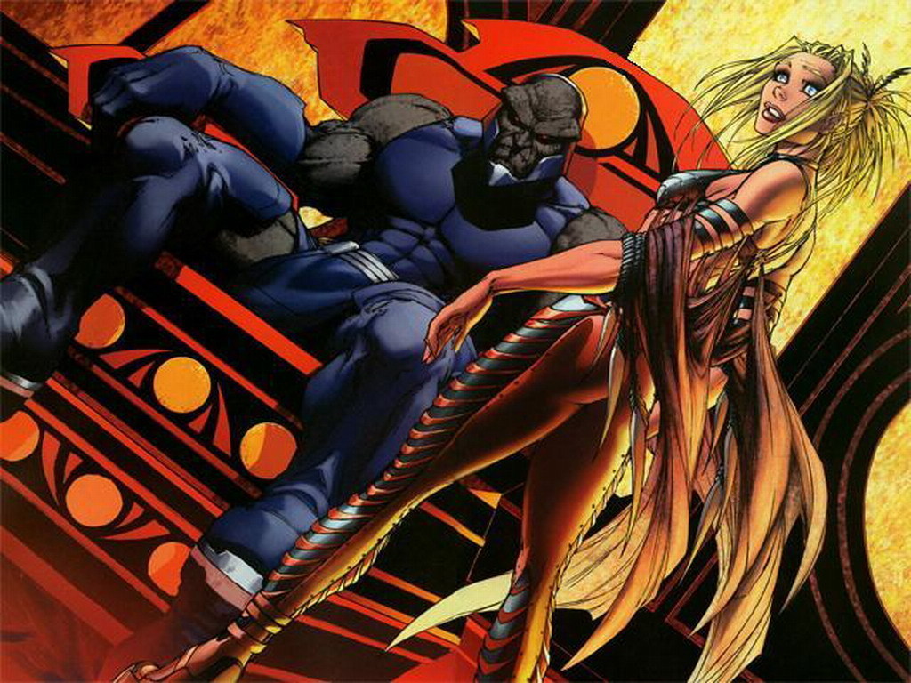
The look is very simple, but he still looks like a guy I don't want to mess with. The focal point on Darkseid should be his face, as it is his distinguishing trait, not at multiple Omega symbols all over his body.
And as always, I feel that if a character is going to be popular, kids need to be able to draw the character. Darkseid is one of the premier, if not THE, premier supervillain at DC Comics. Kids should be able to draw him. Alex Ross made this point recently, and it's very true. Look at the most popular superheroes out there; Superman, Batman, Spider-Man, Wolverine, Hulk, etc, are all simple enough for kids to draw. This new Darkseid is going to give professional artists problems, let alone the amateurs out there.
Maybe comics would be delayed less if their costumes were easier to draw!