
This look is very busy, and needlessly so I feel. Having the Omega symbol plasted all over every aspect of this design is like Superman being covered in S-shields, or Batman in Bat-symbols. A logo or symbol should be a single focal point, not plastered over the outfit over and over again like we see here.
I liked the old Darkseid look far better; few men can wear a skirt and still look badass doing it (hello Dr. Doom), and Darkseid is one of them. Here is his original look, as interpreted by Michael Turner.
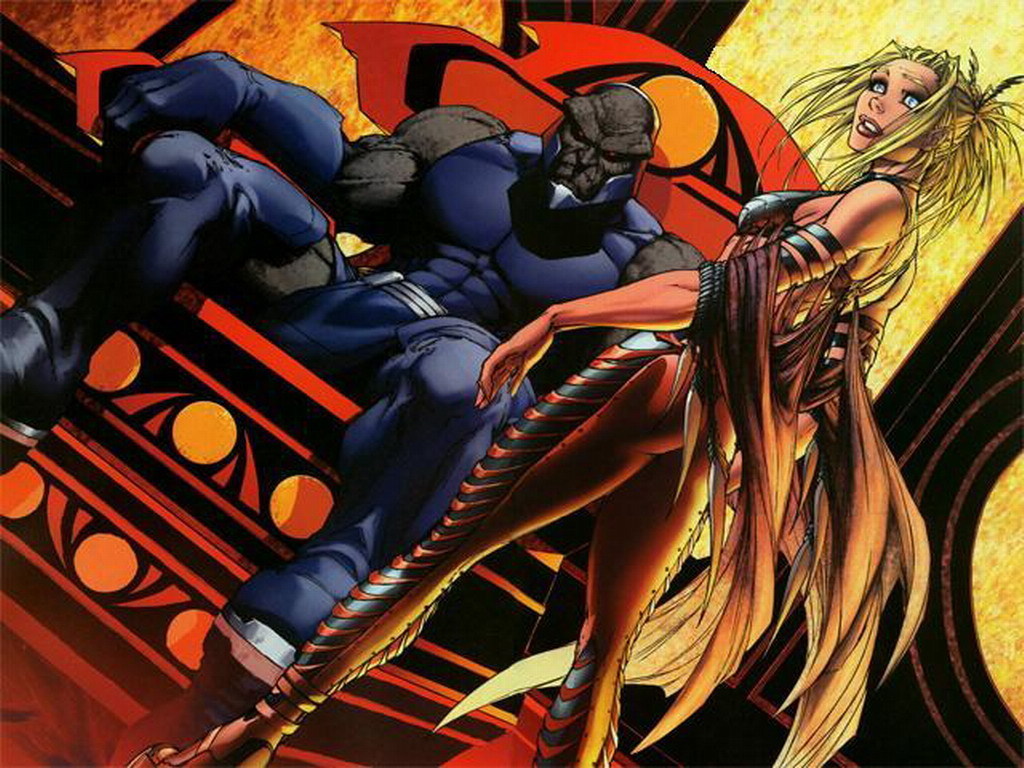
The look is very simple, but he still looks like a guy I don't want to mess with. The focal point on Darkseid should be his face, as it is his distinguishing trait, not at multiple Omega symbols all over his body.
And as always, I feel that if a character is going to be popular, kids need to be able to draw the character. Darkseid is one of the premier, if not THE, premier supervillain at DC Comics. Kids should be able to draw him. Alex Ross made this point recently, and it's very true. Look at the most popular superheroes out there; Superman, Batman, Spider-Man, Wolverine, Hulk, etc, are all simple enough for kids to draw. This new Darkseid is going to give professional artists problems, let alone the amateurs out there.
Maybe comics would be delayed less if their costumes were easier to draw!
That was one of the greatest post titles I've ever seen. On the other hand, plenty of Kirby's designs WEREN'T exercises in elegant simplicity. Most of the Asgardians and New Gods wore extremely elaborate outfits, armors with all sorts of byzantine decorations. I don't know how many kids could convincingly draw Mister Miracle-- most adult artists fail to pull off his complex costume pattern.
ReplyDeleteOf course, I agree with the disappointment over the Jim Lee Darkseid design. Having a red omega symbol pointing towards his groin isn't exactly fearsome.
I agree that a fair amount of Kirby designs were pretty crazy, and some of them, dare I say it, don't really work. But then again, Mr. Miracle isn't a character that I would consider to be wildly popular (though I've always had a soft spot for him). I'm not saying a character can't have a complicated costume, but it shouldn't be needlessly complicated. You'd never, ever, see Jack plaster a symbol (in this case the Omega symbol) over every inch of the character.
ReplyDeleteI think Lee has a thing for highlighting the crotch; his Supergirl redesign is pretty creepy for that.